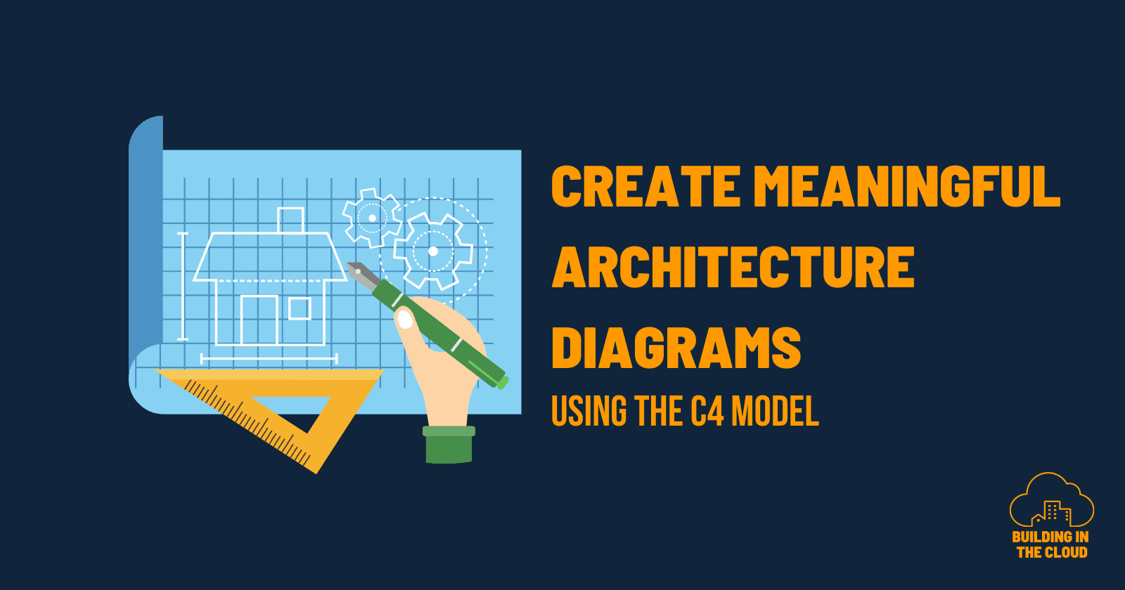
Create meaningful architecture diagrams using the C4 model
Take a step back and find new perspectives by zooming out
👋 Hi my name is Christian.
I am working as an AWS Solution Architect at DFL Digital Sports GmbH. Based in cologne with my beloved wife and two kids. I am interested in all things around ☁️ (cloud), 👨💻 (tech) and 🧠 (AI/ML).
With 10+ years of experience in several roles, I have a lot to talk about and love to share my experiences. I worked as a software developer in several companies in the media and entertainment business, as well as a solution engineer in a consulting company.
I love those challenges to provide high scalable systems for millions of users. And I love to collaborate with lots of people to design systems in front of a whiteboard.
I use AWS since 2013 where we built a voting system for a big live TV show in germany. Since then I became a big fan on cloud, AWS and domain driven design.
What do typical architecture diagrams look like? A bunch of boxes or icons connected by some dashed or solid (sometimes both) lines? While this can be a good starting point, it might not be what we as architects want to achieve in the end.
In this article, I will describe how C4 context diagrams help me to create meaningful architecture diagrams and helps our teams to build better solutions. Based on a practical example from one of my past enablements, you will learn how stepping back and zooming out supports you to tackle complexity, build a shared mental model and results in better decision-making.
Tales from a migration project
It was the end of 2021 when the "project wheel of fortune" selected me to support a team on its journey to migrate a Customer-Identity-Management (CIAM) solution from Vendor A to Vendor B.
In the past years, there was one single product owner who had ownership of a bunch of domains related to customer relationships. This included customer acquisition, customer support and digital marketing. With the help of some external agencies, the product owner was able to set up a CIAM solution including login and registration flows by using a no-code approach. The result of his work was a set of widgets that can be embedded into websites or mobile applications. Once the product owner finished the configuration, he asked the team that is responsible for the companies website to embed those widgets so that customers can
register for a new account
login with their credentials or social identity providers
manage their profile
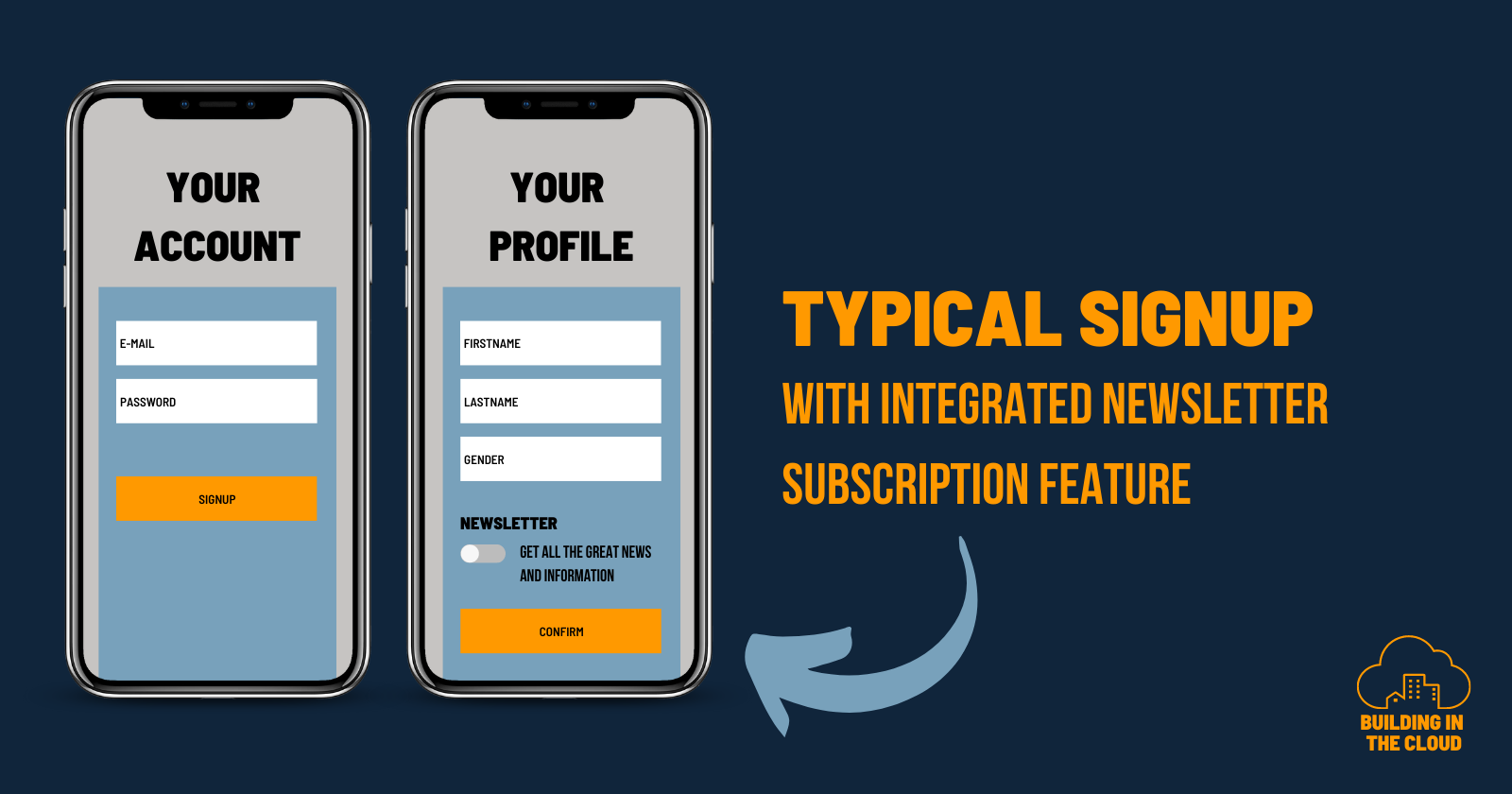
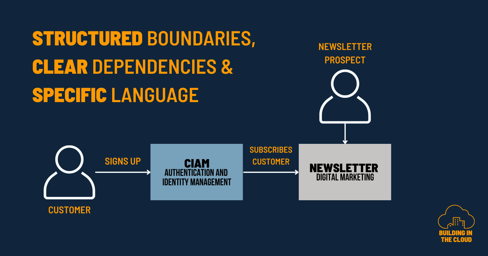
The image above shows a typical signup flow that covers multiple business domains including identity management and digital marketing - in this case, implemented as a consent toggle that asks the customer if a subscription for the newsletter should be created along with signing up for a new account. A nice composition of multiple use cases.
When architecture diagrams scream for help
One of the lead developers of the team was well-prepared for the project kickoff of the CIAM migration. He spent a lot of time catching up on the development of the last years and he created an architecture diagram of the current status quo. And he said
I told you, this will be more complicated than we all expected!
Do you know this uncomfortable feeling of standing in a crowded elevator? Architecture diagrams feel the same when the number of boxes and arrows outweighs the available space on your sheet. By carefully listening, you can hear them screaming for help - silent and lonely. I call this: A screaming architecture.
There are boxes over boxes connected with lines in different weights, and styles using multiple connectors. Sometimes dashed, sometimes solid. There might be also cases where boxes have inner boxes that occasionally have inner boxes. Some of these boxes are big, some are small, some have borders, and some have none. An impenetrable jungle of shapes and colors with some flavor of abstract art.
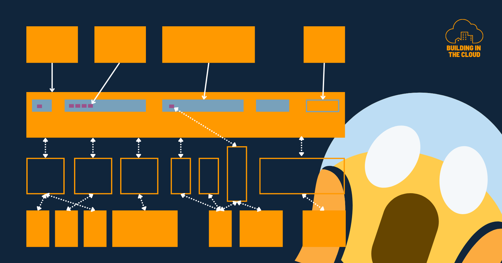
There is a saying that a picture is worth more than a thousand words. With this screaming architecture diagram the opposite is true. For me, the clearly articulated intention of this diagram was a warning sign for all stakeholders involved in this project to not underestimate the effort of our migration project. There was incredible value and feedback behind those boxes and lines. We as architects can use this to better support teams.
You can see a lot of dimensions when you start looking at those diagrams from different perspectives and start talking with people to let them express their intentions and thoughts. At first sight, it was the sign of a tightly coupled system. At second sight, it was a sign that we do not understand the context we are in and the problems we have to solve. I felt like sitting in front of a knotted parachute right before jumping out of a flying plane for our first formation jump. My intention told me: "You better untie the knots and sort things before you jump out of that plane."
But it was good that this diagram was created. It was the start of a series of very insightful discussions.
Building a solution starts by understanding the problem
The original (screaming) architecture diagram and the underlying user journey revealed interesting dependencies, intentions and terms. By interviewing stakeholders, we got an idea of the current state of domain language and mental models. The product owner told us about two types of registrations:
A full registration means you register for a new account either with an e-mail/password or with one of the given social identity providers. All these accounts are flagged with the type of "full-registration".
A light registration is a newsletter subscription. It is called light because you only have to provide an e-mail address without a password or any other information about your profile. It is just for managing our newsletter subscribers. All these accounts are flagged with the type of "light-registration" but you cannot log in as you have not provided a password or something like this.
We identified, that this thing called "light registration" was the concept of a newsletter subscription pressed into a CIAM domain. The reason why it was built like this, was because the newsletter system did not provide any no-code integrations into customer-facing applications. The only option the product owner considered was to configure yet another modified registration flow within the old CIAM system. And asking an agency to build some ETL jobs to move data from the CIAM into the newsletter system and vice versa. This resulted in a tremendous amount of technical debt and complexity. Completely ignoring different problem spaces, system purposes, business domains and the fact that not every use-case that requires an E-Mail address and consent is by default related to CIAM.

The discussions we had while trying to understand the status quo were extremely valuable. It highlighted:
Unclear domain boundaries: Domains of Identity Management and Digital Marketing (Newsletters) were like two magnets attracting each other over time resulting in low cohesion and tight couplings on a system level.
Insufficient domain knowledge of the team: As the job of the development team was just to embed some widgets, they never had the chance to take a step into the real problem space. They never had the chance to challenge things and their solution space was just thinking about how to embed external widgets on the website.
Whenever I get this overwhelming feeling of not understanding the context I am in, of too much complexity or whenever I need too much time to process the vast amount of information transported in a diagram - I know it is time for a new perspective. It is time to step back and zoom out.
This helped to shift the focus from just looking at the technical-centric status quo, more into a customer-centric state-to-be. We started to embrace problem-first thinking by zooming out.
If you get lost in boxes and lines - zoom out
I use the C4 model to design software solutions. The general idea of this model is, to provide several layers with a defined purpose and perspective of your solution. Every layer is connected and allows you to zoom in and out at will.
A Context Diagram is a diagram with the highest zoom level. It provides a holistic view of the system you are building or extending.
A Container Diagram is the first zoom level that reveals the inner building blocks of your system. It provides a more detailed perspective of the systems components and their interaction. Each component is named generic as a container (NOT DOCKER) hence its designation. A container represents something that needs to be running in your system for it to work. This can be an application, service or data store.
If you zoom into a container you find yourself in the middle of a Component Diagram. On this level of detail, you get the perspective of the parts your container is composed of. In the context of building solutions running on AWS, I often use AWS Service-Icons or enterprise integration patterns to express implementation details.
Last but not least there is the level of Code Diagrams that show you actual code structures and relationships of classes, functions or other low-level details.
Elements of a context diagram
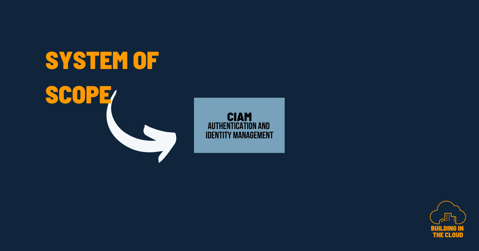
The primary element is the blue box describing the software system you want to build. Sometimes you end up having more than one system and from my perspective, this is okay for the moment.
Supporting elements are the people (users, actors, roles,...) and external systems (the grey boxes). External systems are those your team has no or limited control about. But we can not ignore those systems as they somehow interact with our system of scope.
Connections between the primary system and the supporting elements describe the flow of information and data in between. Connections can also be used to describe certain use cases or intentions of how to use the system.
Our CIAM context
By providing several levels and layers, the C4 model supports my maneuver of zooming out. We started to increase the altitude to get a more holistic perspective on what we wanted to achieve. So we started to draw a context diagram by putting the system we build - a CIAM - in the center of our diagram.
Describing the world around CIAM was the next important step. Start by asking yourself and the team: "What are the systems and users that interact with the one we build?". The level of detail is not important at this stage as we intentionally zoomed out and want to see the bigger picture.
The main focus here is on actors, roles, personas and software systems instead of technologies, cloud services or other implementation details. Prevent yourself (and your team) from getting lost in details by putting things like API Gateways, S3 Buckets etc on the surface. We don't want to create yet another screaming architecture. Try to define the software systems instead of the individual components. If the context diagram contains a level of detail that you could show non-technical people, you are on the right track.
This step enables valuable discussions with a lot of feedback and discovery opportunities. Instead of just drawing lines and boxes we started to embrace problem-first thinking. We started to think more about HOW a system is used instead of WHAT the system is composed of.
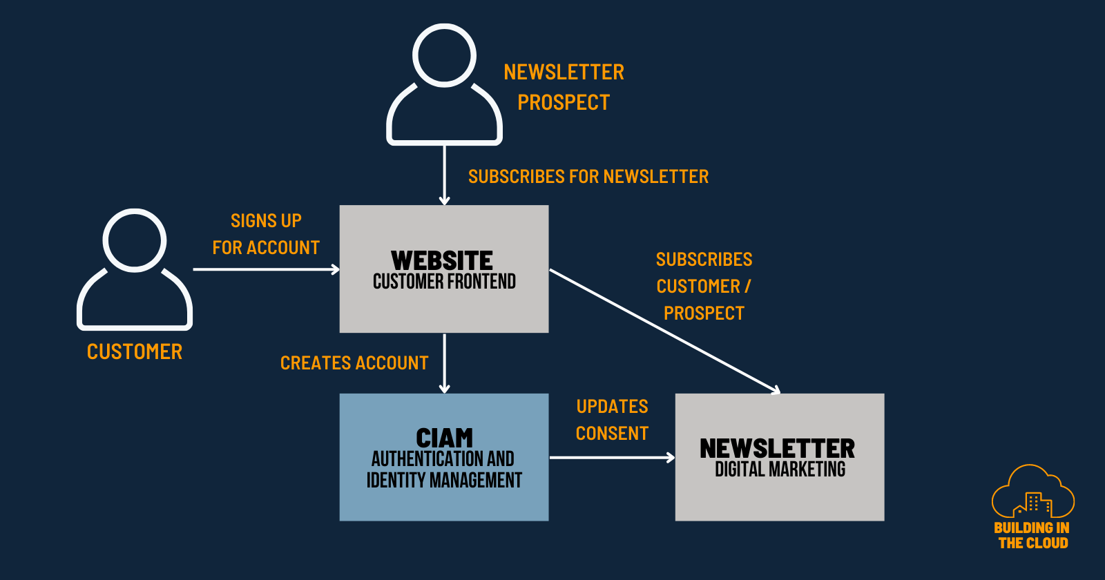
We ended up challenging the current state of service composition and decided how we want to modularize the systems. This resulted in a more domain-aligned composition of systems with clearer boundaries and responsibilities. Our CIAM system of the future should be responsible for all things related to our customer lifecycle, authentication and authorization. Our newsletter system should be decoupled from CIAM concerns but at some point integrated. The backend of the website as another external system should route and orchestrate information and data to the right systems depending on the given use cases. The final context diagram looked like this.
Feedback after running in production
We see improvements along the way in terms of maintainability and interchangeability of systems after having this now in production for several months.
A nice story that underlines especially the interchangeability improvements: The service contract with the newsletter system is about to end. The team gave the feedback that exchanging the existing newsletter system with something else is now easier than before. That is great to hear and a great achievement of the work of the whole team.
We also see that this way of reducing complexity gives both our digital marketing and CIAM team more flexibility in doing their job. By having this clear separation of concerns, both teams can work more independently. Resulting in less collaboration and communication across teams along with overall improvements in software delivery performance.
Wrap-Up
Making a step back and creating a context diagram with the team was a success story and helped to improve systems thinking. We ended up having a common shared mental model of the thing we want to build. And we defined clear boundaries along business domains with a stronger separation of concerns.
Good whiteboarding and diagram skills are essentials in your architect toolbox. The easy part is to grab a marker and then start and draw some lines and some boxes. But does this help? Does this make an architecture diagram meaningful and a whiteboarding session useful? I don't think so. An architecture diagram is not a silver bullet. Depending on what you want to express, it is more than just a bunch of boxes connected by some lines. There are several aspects and approaches you can use to give your architecture diagrams more meaning and increase the value of those assets. Zooming out is one aspect and it can be a powerful method. In this post, I described my learnings from using C4 context diagrams to
form a shared mental model,
a ubiquitous language and
to foster problem-first thinking.
What's the purpose of building software? The purpose is to solve a customer problem. Building a solution starts by understanding the problem we want to solve. Not by creating screaming architecture diagrams.
/